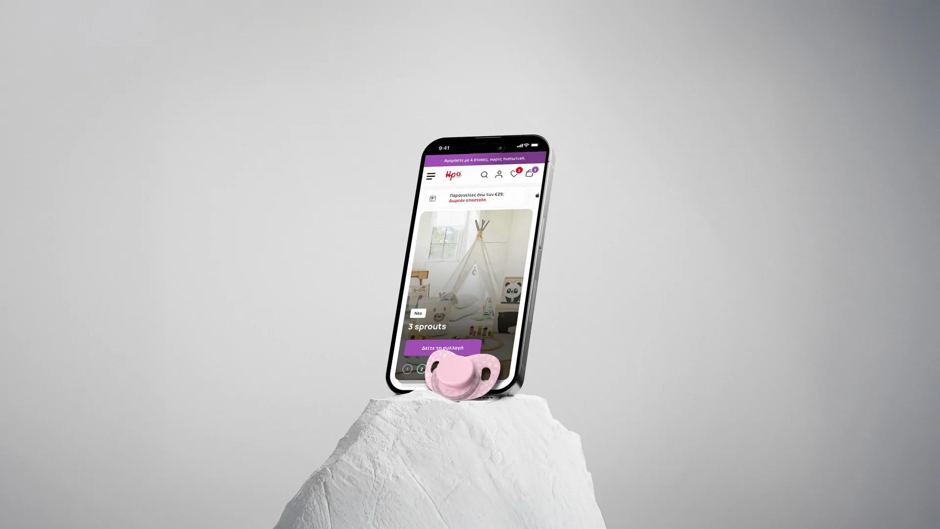
IroKids 2025 Case Study
Small Brand, Big Impact
A Few Words
By 2025, Irokids.gr had been running on the eShop we designed back in 2020 for five whole years. The brand had outgrown it, after all, a lot changes in eCommerce over half a decade, and the client suspected the site was no longer pulling its full weight. They came back to us to uncover the where, what, and why behind the issues, and to fix them.
The Goal
Our mission was to uncover the hidden barriers to conversion and transform the eShop into a high-performing, modern platform. To achieve this, we focused on three primary objectives:
- Diagnose & eradicate friction: Identify the exact pain points getting in the way of customers completing a purchase and systematically remove them from the user journey.
- Elevate the visual experience: Modernize the interface to capture a new generation of shoppers while maintaining strong brand alignment.
- Unify the eMail ecosystem: Rebuild the entire system of customer-facing transactional emails to bring the same level of clarity, design care and brand consistency to a significant post-purchase touchpoint.
- Recover lost revenue: Turn a site that was performing “just fine” into an optimized, high-converting platform by fixing the silent drop-offs.
The Challenge
The eShop wasn’t failing in one obvious way. Rather, it was falling short in a dozen small ways that added up.
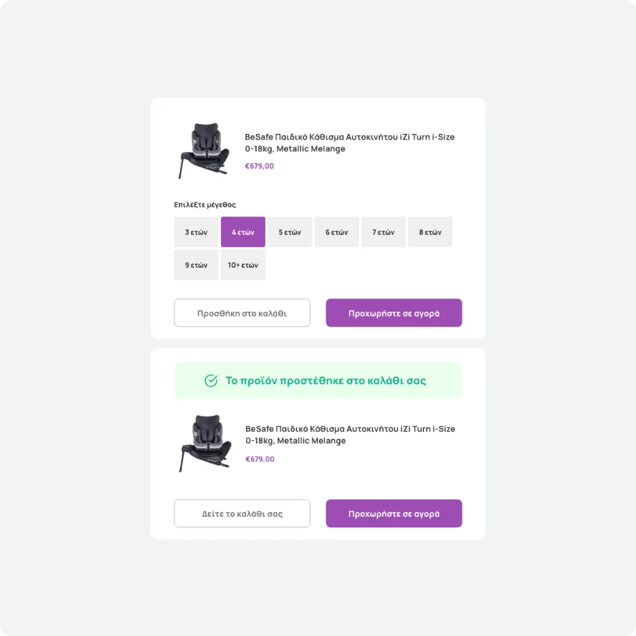
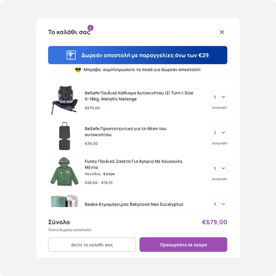
The “Add to Favorites” feature silently failed more often than not. Filters didn’t always apply or they reset the moment a user hit “back”. Vague category names like “infant strollers” versus “kids’ strollers” sent shoppers down the wrong path entirely. During checkout, the issues multiplied: some users hit a dead end and were bounced back to the homepage mid-signup, losing their carts, while others faced failed transactions with zero explanation.
None of these issues were catastrophic on their own. Together, they created the exact kind of friction that makes a customer give up. That’s a much harder problem to diagnose than a crashed site and a tougher case to make to a client whose business was still doing fine. But “fine” was just hiding real, recoverable revenue.
The Solution
We kicked off, as always, with a stakeholder workshop to align on requirements and surface the team’s internal insights. A key takeaway was that the eShop’s transactional emails had fallen behind the brand and needed the same design attention as the site itself. Next, we ran two parallel research tracks to diagnose the UX friction:
- Usability Testing
Moderated mobile sessions where we observed users browsing, filtering, and checking out in real time, pinpointing exactly where flows broke down. - Behavioral Analysis
A review of 50 user session recordings combined with two targeted on-site surveys (on product pages and post-purchase) to quantify these breakdowns at scale.
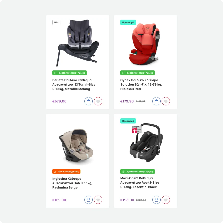
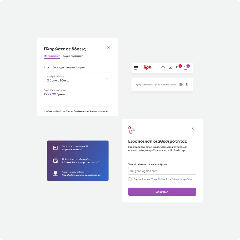
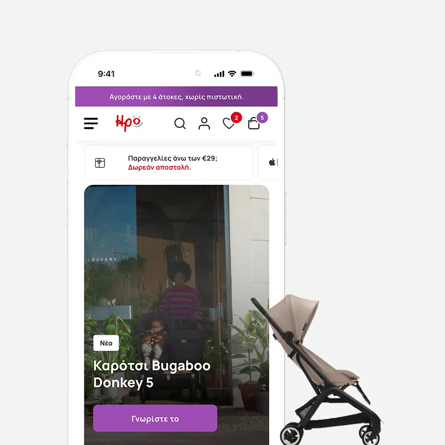
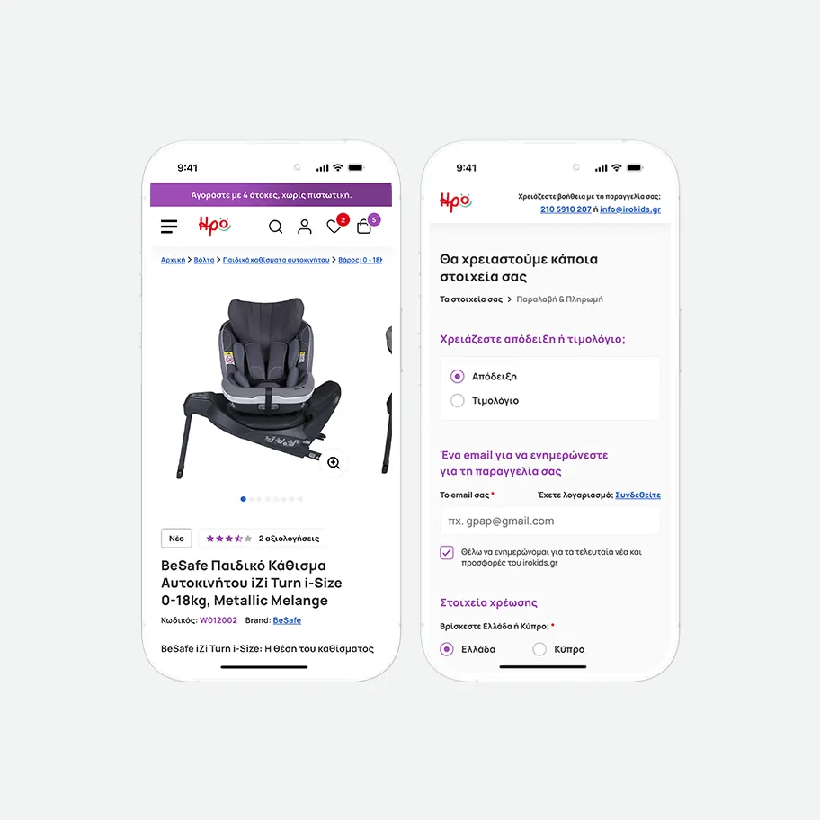
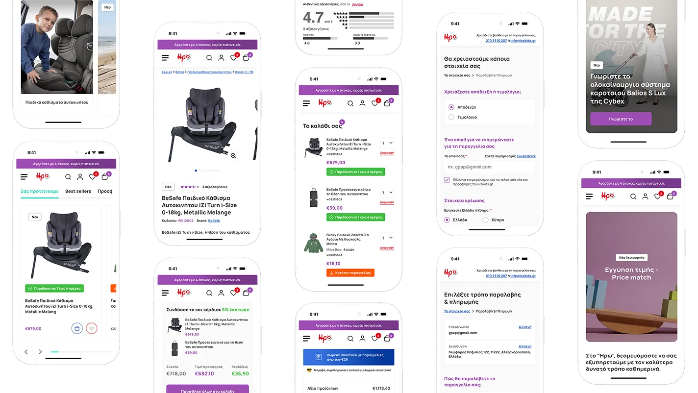
Armed with data on what was costing the brand sales, we moved into the redesign. The goal was twofold: systematically eliminate every friction point uncovered by research, and elevate the visual experience to attract a new generation of customers and drive higher engagement.
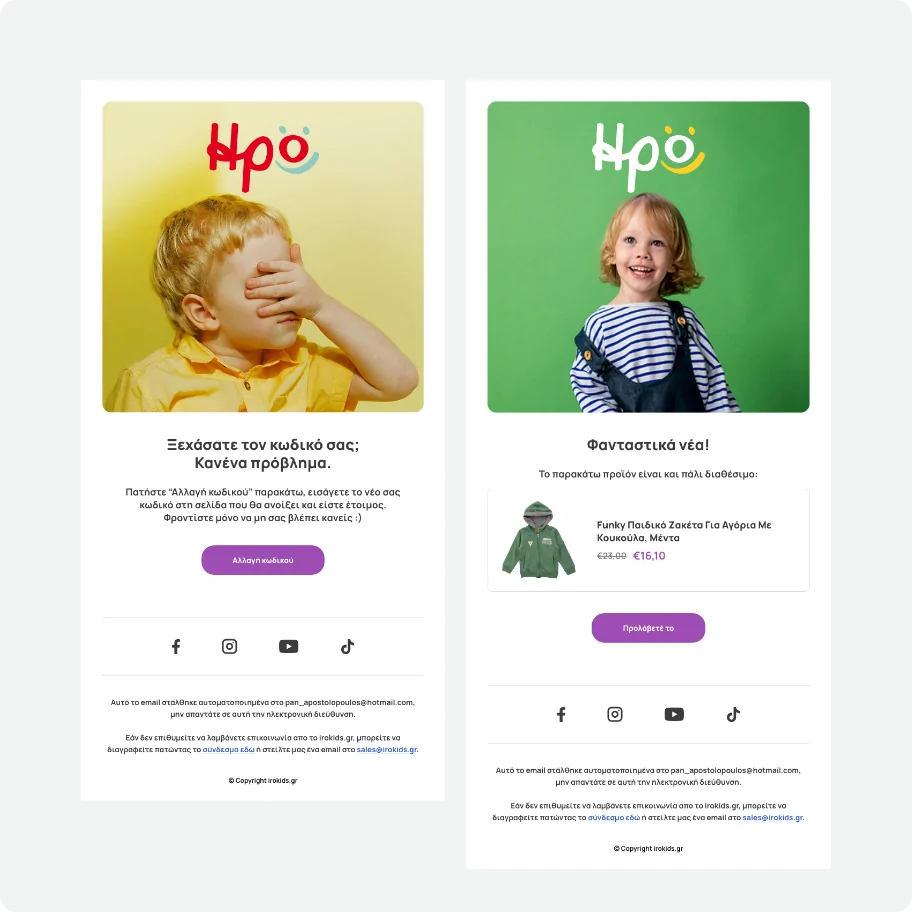
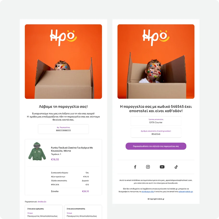
Finally, we rebuilt the entire ecosystem of customer-facing emails, from order confirmations and shipping updates to back-in-stock alerts. By bringing the same clarity and brand consistency to these automated touch points, we ensured a seamless experience even after a customer leaves the website.
Project Outcome
The year-over-year metrics validate that when you eliminate the micro-frustrations that leak sales, you don’t just patch an interface, you build an optimized retail ecosystem where customers return and browse with absolute confidence.
By repairing the invisible fractures in the user journey, we fundamentally changed how users interact with the brand. Increasing engagement time and views per user demonstrates that when a retail system functions flawlessly, users naturally explore deeper, stay longer, and convert without hesitation.