IroKids 2020 Case Study
Raising an eShop
A Few Words
When Irokids approached us for a redesign, it quickly became clear that a simple refresh wouldn’t suffice. We approached the project as a ground-up design challenge, prioritizing deep user research into how parents shop before creating a single wireframe.
The Goal
Design an eCommerce experience that could genuinely serve three different personas: Parents, parents-to-be and people shopping for a meaningful gift for a family with children, and turn that into the brand’s ally for everyday family needs. Commercially, the goal was straightforward: more sales, more repeat customers.
The Challenge
Three personas meant three different needs, three different levels of urgency and three different ways of deciding what to buy. A new mother searching for something specific shops nothing like someone browsing for a baby shower gift. Designing a single eCommerce experience that could hold all three without diluting any of them was the real problem to solve, and it meant we couldn’t lean on what already existed. We had to build the experience around the people, from the ground up.
The Solution
We always start our projects with a stakeholder workshop and this project was no exception to that. We facilitated a workshop to surface what the team already knew about their users, paired with a web analytics review run together with NopServices, Irokids’ digital marketing agency, to understand what was actually happening on the site at a behavioral level. After the workshop, we were able to create an initial model of user flows and common behavioral patterns.
In order to go deeper into users’ needs and problems, we decided to talk directly with a sample of our three personas, arranging and conducting a series of user interviews so as to understand their perceptions, the problems they faced, their needs and their expectations.
Design followed directly from those insights. Once we had a direction, we ran guerrilla usability testing sessions on the new design to catch what the interviews couldn’t, and iterated based on the findings.
The redesign covered:
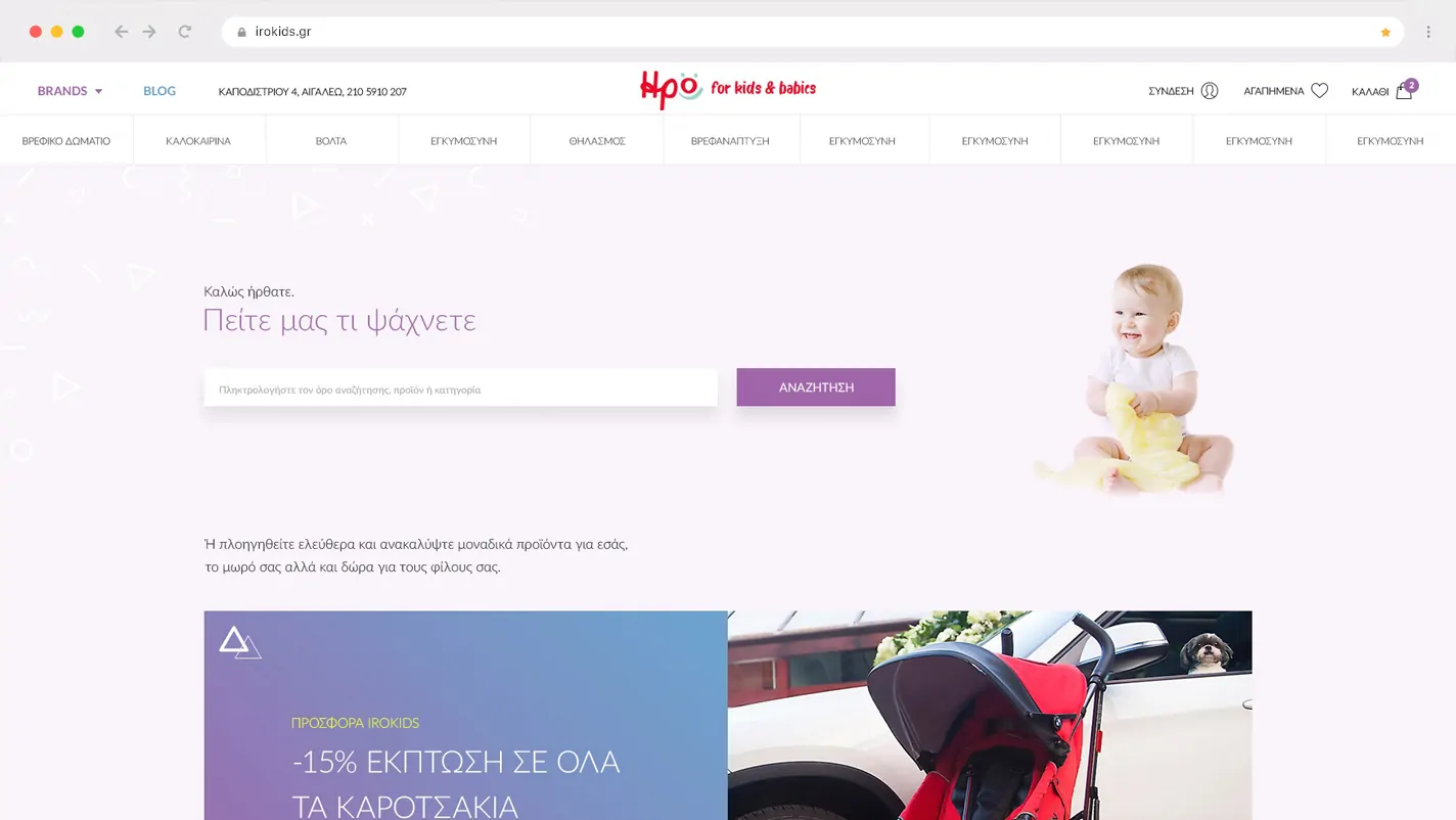
- A “dominant” search functionality to support the main interaction pattern, i.e. easy and efficient searching for specific products, categories and brands.
- An improved navigation and new content structure addressing the needs of the users.
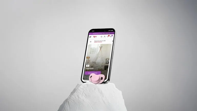
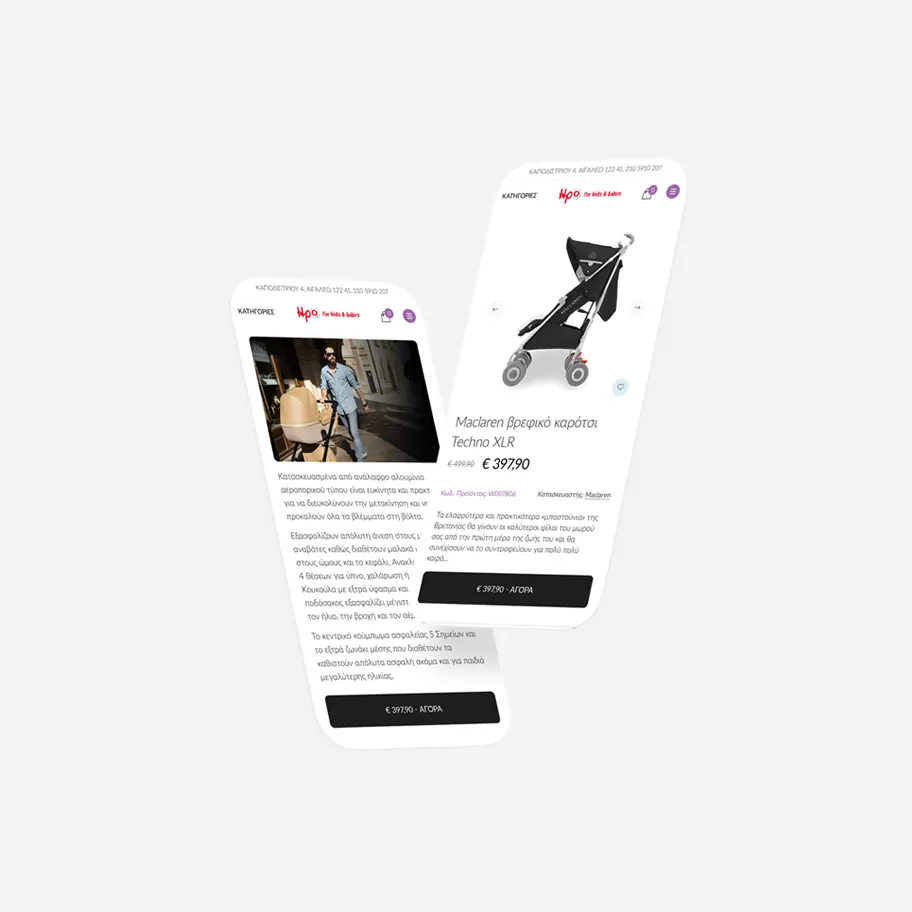
- A contemporary design that brought a newly developed brand identity to life on the eShop, moving away from the icon/illustration approach, common among competitors, in favor of real, relatable photography of parents and their children, something users could see themselves in. Our approach drove emotional connection and engagement.
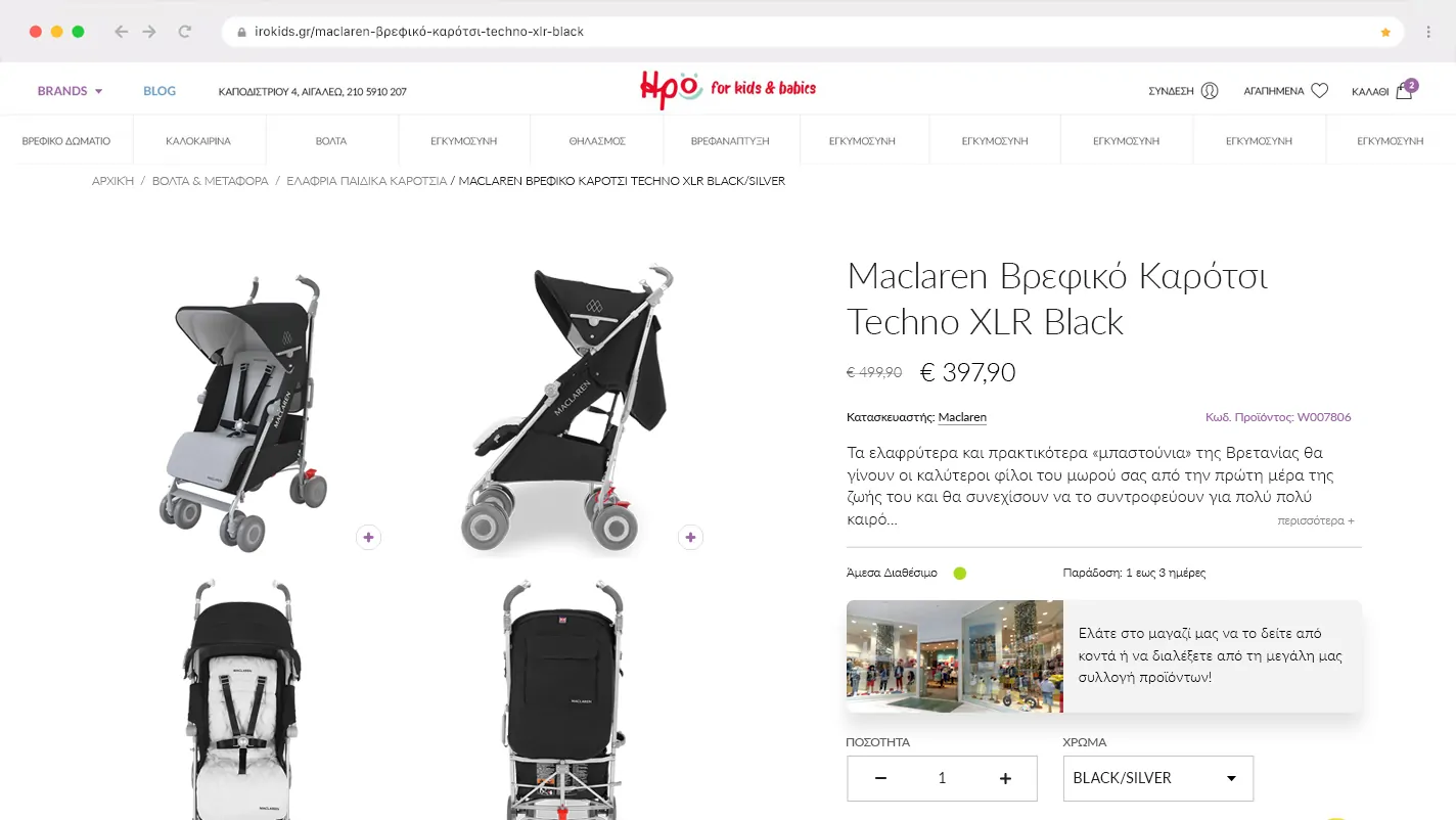
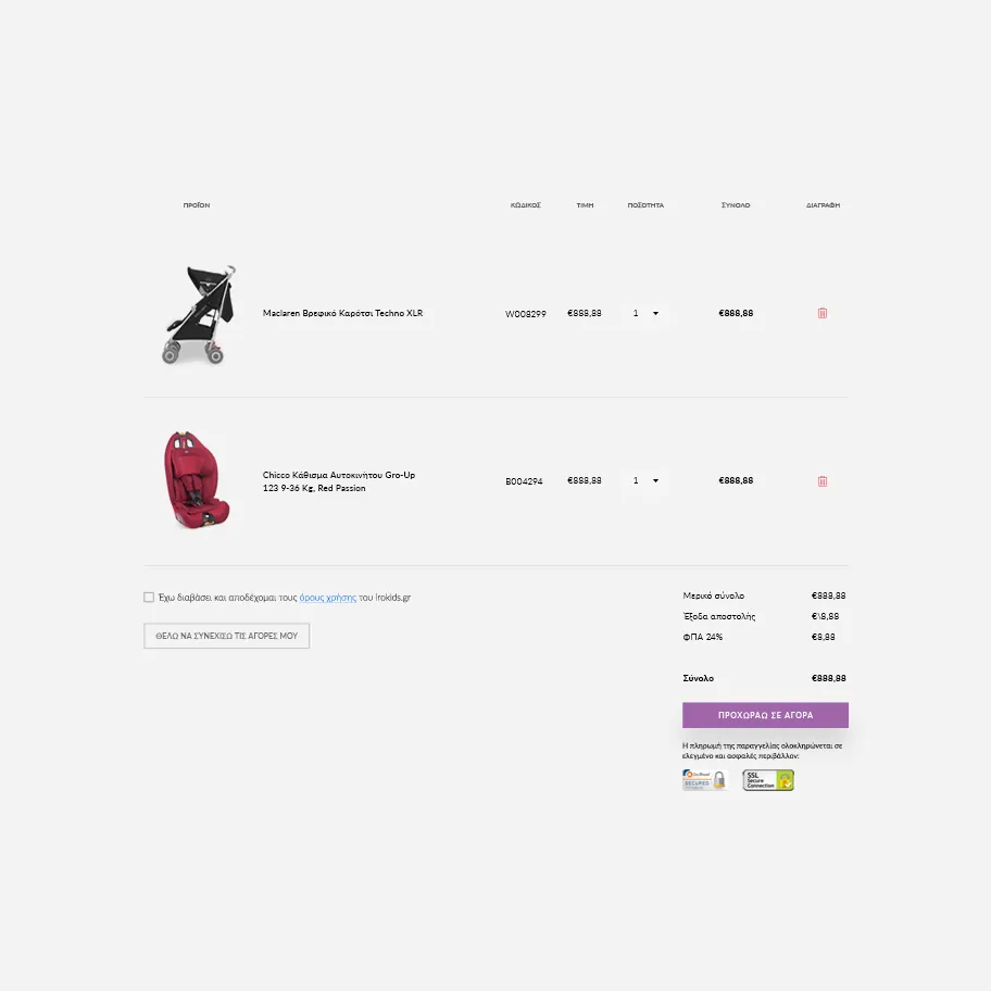
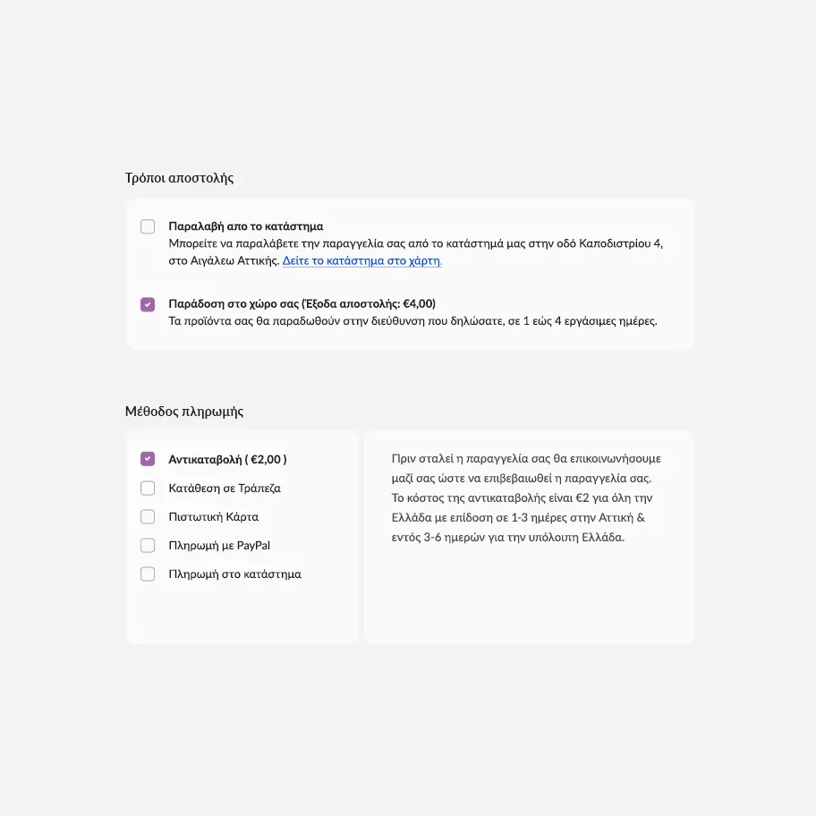
- A streamlined, 1-page checkout that cut down on steps and friction between “add to cart” and “order placed”.
- A completely redesigned mobile experience which is now more content-focused and therefore user-focused.
- Last but not least, we introduced a blog section and product landing pages to promote and support the forthcoming digital marketing campaigns.

Project Outcome
A 500% increase in sales from organic visits sounds made up until you’ve seen the data. It wasn’t a trick, it was designing for who was actually showing up to shop. Raising an eShop from nothing is the hard part; what came after, the client decided, was worth investing in for the long run. This wasn’t going to be a one-off.
The project won Best Baby Online Store and Company of the Year at the Mother & Baby Awards 2020, followed by Best Baby Shop in 2021, a recognition shared with NopServices, who partnered with us on development and digital marketing throughout the project.
We are proud of our work and humbled by the recognition.
-
Best Baby Online Store
Bronze
-
Best Baby Shop
Silver