Nespresso Case Study
Elevating the Nespresso Experience
A Few Words
Nespresso’s philosophy is built around delivering a premium, smooth customer experience. In line with this vision, the product team set out on a major redesign of its key digital properties, so its online presence would match its high standards. Before committing to any changes, the team wanted to ground their decisions in real user needs and behavioral data. They wanted to assess the overall user experience, identify usability issues, and distill practical insights to inform the redesign.
The Goal
We wanted to better understand how different user types (low, medium, and high online shoppers) were interacting with the existing experience on both mobile and desktop, in order to support the product team during their redesign phase. To make that happen, the following objectives were set and measured along the way:
- Identify usability issues affecting users across key scenarios like finding products, placing orders, and managing their accounts.
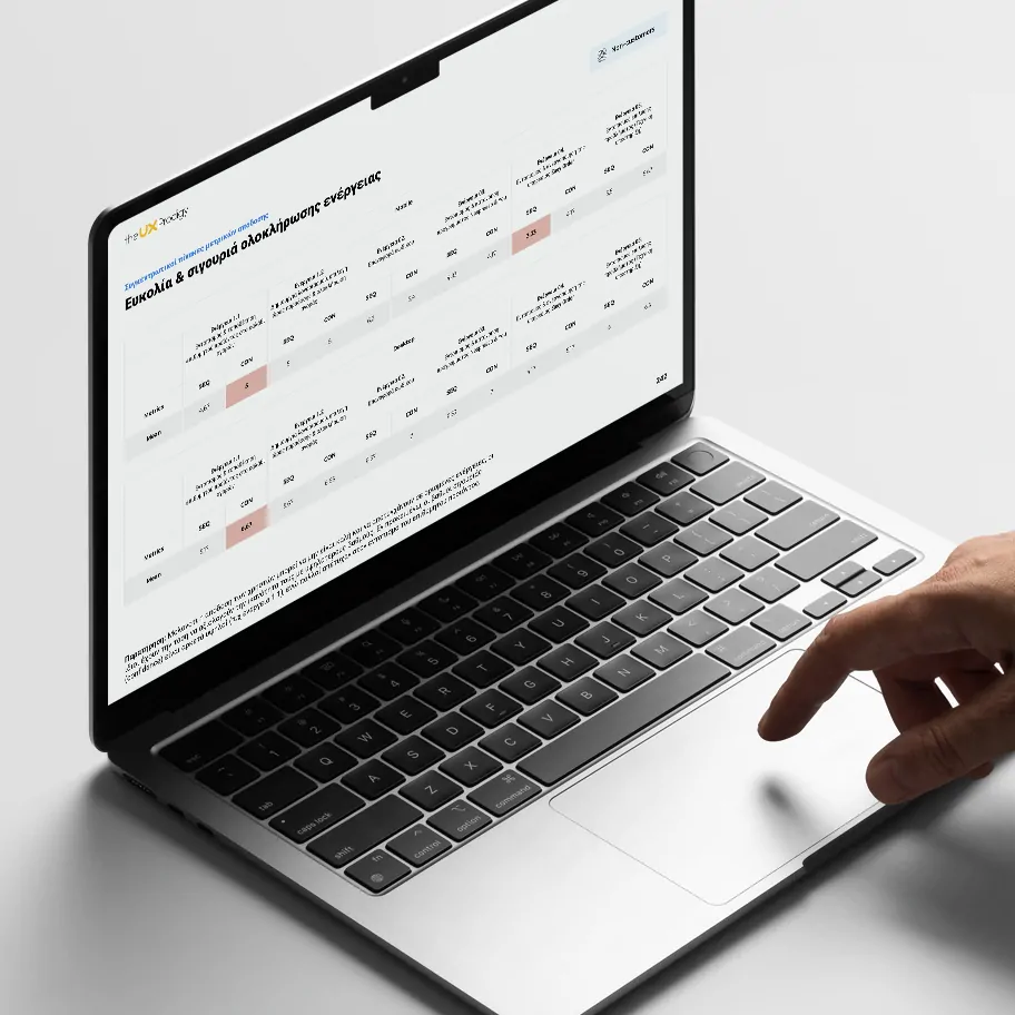
- Measure the user experience by capturing both qualitative feedback and quantitative metrics, including Task Completion Rate, Time on Task, Single Ease Question (SEQ), User Confidence, and UMUX-Lite scores.
- Prioritize all identified usability problems by severity, based on their frequency and impact on task completion, in order to focus development efforts on the most critical issues.
- Deliver actionable, high-level design recommendations that would directly inform the redesign and simplify user journeys.
The Challenge
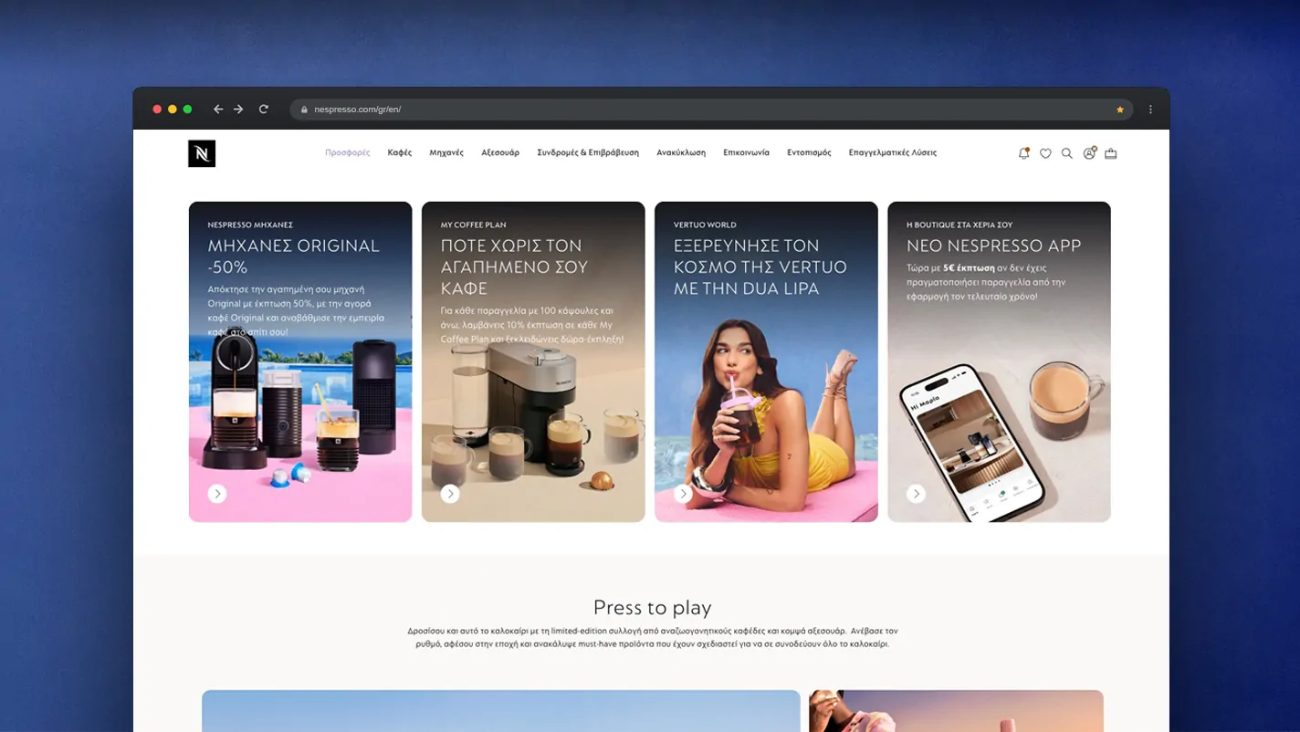
We tested with 20 participants across desktop and mobile environments, segmented by their online shopping behaviors and past experiences with similar products. Users liked the modern design and the brand consistency, but the usability sessions surfaced the following barriers:
- The menu structure did not match user expectations, causing frustration as they looked for items in places other than where they were located.
- Filters on the capsule listing pages were not visible, disappearing from the viewport as users scrolled.
- The labels and descriptions for the recurring order service and the loyalty program did not guide users well enough to understand their value proposition.
- Working within Nespresso’s universal brand standards was a constraint in itself. Not every component of the website was easy to control, which limited how far some issues could be addressed.
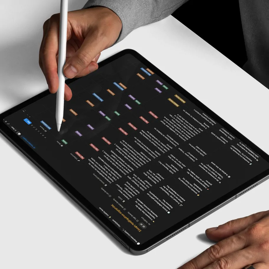
The Solution
With the findings in hand, we showed the Nespresso product team how some design and content changes could provide a more usable experience and drive sales. Within a year they had fixed 86% of the issues we identified, focused on:
- Rebuilding the information architecture so the site’s structure and wording matched how users think.
- Making specific features and services easier to locate, understand, and activate.
- Rewriting copy in key areas, like the checkout flow, so people understood and trusted what they were doing before they bought.
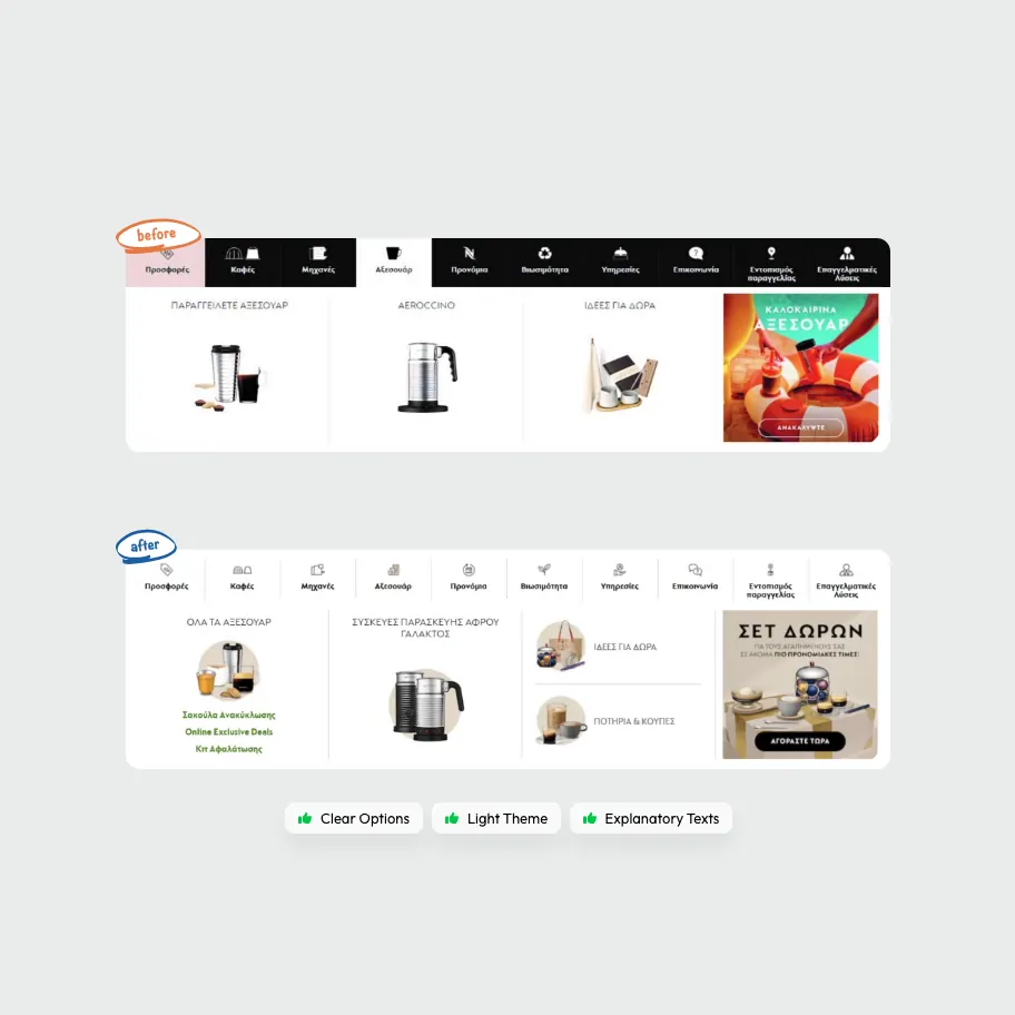
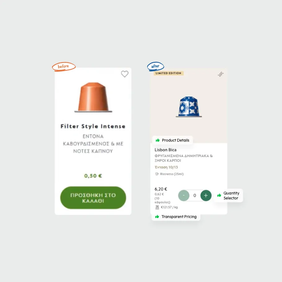
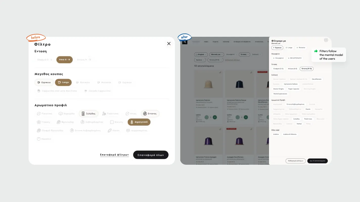
Project Outcome
The usability study and subsequent redesign efforts led directly to measurable improvements in user satisfaction, customer loyalty, and business performance:
Nespresso is a clear example of how one research method, used well, can shape design decisions and move real numbers. Usability testing pointed to what was getting in people’s way, the team fixed it, and satisfaction, loyalty, and sales all followed.
We are proud of our work and humbled by the recognition.
-

Best Use of Customer Insights / Feedback
Bronze