Listen to this article
Ready
0% read
Author(s)

Related Service(s)
Accessibility is often treated as a large, complex “later” task in web projects. In reality, many of the most impactful improvements are small, fast, and can be implemented during everyday design, development, and content workflows.
This article breaks down 10 easy fixes that significantly improve accessibility for users with disabilities, covering visual, motor, and cognitive needs. These are practical improvements for designers, developers, and content authors alike.
1. Add meaningful alt text to images
Without meaningful alt text, users with visual impairments may miss important information conveyed by images
Good Alt text:
- A team of designers reviewing wireframes on a whiteboard.
- Red warning icon indicating form error.
- Infographic summarizing 10 practical website accessibility improvements based on WCAG best practices.
Bad Alt text:
- Event photo .1
- IMG_1234.jpg
- Accessibility
Tip for teams:
- Define whether each image is informative, functional, or decorative during design.
- Focus on why the image is included and what users should learn from it, not just what it looks like.
- Aim for a brief description that communicates the essential information without unnecessary detail.
- Don’t repeat information already provided in nearby headings, captions, or body text.
Alt text is not just a description of an image, it is a way to communicate essential information and ensure no user is left behind.
2. Ensure sufficient color contrast
Low contrast is one of the most common accessibility issues on websites.
Threshold:
- Normal text: at least 4.5:1 contrast ratio
- Large text: at least 3:1
- Non-text elements: at least 3:1
Quick wins:
- Ensure sufficient color contrast between text and its background.
- Ensure sufficient color contrast between user interface components and adjacent colors.
- Avoid placing text over background images with complex or highly varied color palettes.
- Test with contrast-checking tools before finalizing designs.
Maintaining proper color contrast improves readability, reduces barriers for users with visual impairments, and creates a clearer experience for everyone.
3. Don’t rely on color alone to communicate meaning
Color should never be the only indicator of status or meaning.
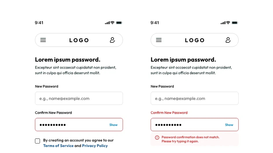
Problem example:
- “Red = error – Green = success” with no text or icon support
- A red border indicates that the field contains an error
- Charts with different colors to represent data categories without labels, patterns, or text descriptions
Fix it with:
- Familiar icons, such as warning symbols, check marks, or error indicators.
- Descriptive text such as “Error,” “Success,” “Required,” or “Warning”
- Patterns, textures, shapes, or direct labels
- Short explanations or instructions when an action, status, or error requires user attention
This is especially important in dashboards, forms, and data visualization.
4. Use proper heading structure
Headings are not just visual styling, they create a meaningful navigational structure for screen readers and help all users understand the organization of a page.
A common mistake:
Skipping levels (H1 → H4) or styling text to look like headings.
Best practice:
- One heading 1 per page
- Logical hierarchy
- No skipping levels unless structurally justified
- No empty headings
Content authors should structure headings like a table of contents, helping users quickly understand the page and navigate to the information they need.
5. Make all interactive elements keyboard accessible
Many users navigate websites without a mouse, relying instead on keyboards, switch devices, or other assistive technologies.
Ensure users can:
- Tab through all interactive elements.
- See a clear and distinct visible focus state.
- Activate controls using Enter or Space.
- Navigate complex components using keyboard controls.
- Avoid keyboard traps.
Developers should:
- Build interactions with native HTML elements.
- Verify that custom elements support keyboard navigation.
- Ensure focus moves to the appropriate location
- Check that the tab sequence follows the intended flow of the page.
- Perform keyboard-only testing.
If it can’t be used with a keyboard, it isn’t accessible.
6. Add descriptive link text
Screen reader users often navigate and review links independently of the surrounding content, so link text should clearly describe its destination or purpose.
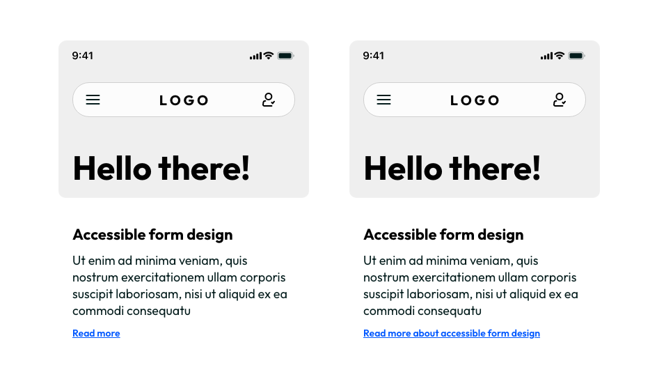
Bad link texts:
- Click here to read more
- Learn more
- Read more
- More details
Good link texts:
- Read more about accessible form design
- Download the accessibility checklist PDF
- Learn more about our services
- View the website accessibility guidelines
- Perform keyboard-only testing.
Clear, descriptive links help everyone understand where a link leads, while allowing screen reader users to navigate efficiently and independently.
7. Label all form fields clearly
Forms are one of the highest-friction accessibility areas because users must understand what information is required, where to enter it, and how to correct mistakes.
Every input should have:
- A clear, visible label.
- An accessible label that screen readers can announce.
- Helpful instructions or examples when needed.
Avoid:
- Using placeholder text as a replacement for labels.
- Unclear or generic labels such as “Name 2,” “Info,” “Details,” or “Input”.
- Ambiguous instructions that force users to guess what is expected.
- Relying only on visual design elements such as placement, icons, or surrounding text.
Clear and accessible forms reduce confusion, prevent errors, and help all users complete tasks more efficiently and confidently.
8. Provide clear focus indicators
When users navigate with a keyboard, they need to see where they are on the page and which element is currently selected.
Good focus indicators:
- Use a clear visual indicator, such as an outline, border, or highlight.
- Apply the same focus style throughout the website or application.
- Have enough contrast against the background and surrounding elements.
Avoid:
- Removing outlines via outline: none; without providing an accessible replacement.
- Using focus indicators that are too subtle.
- Relying only on color changes.
- Placing focus indicators behind other elements.
This simple CSS improvement requires minimal effort but delivers a major accessibility benefit by making keyboard navigation clearer for all users.
9. Write clear, simple content
Accessibility is not only technical, it is also linguistic. The words, sentences, and structure of your content play an important role in helping users understand and interact with your website.
Improve readability by:
- Using short, clear sentences.
- Avoiding jargon where possible.
- Structuring content with bullets and headings.
- Explaining acronyms on first use.
- Providing clear instructions.
- Keeping paragraphs short.
Clear, well-structured content reduces cognitive effort, improves understanding, and ensures that more users can access and engage with information effectively.
10. Add accessible form error messages
Generic error messages like “Invalid input” or “Form error” do not provide enough information for users to understand what went wrong or how to fix the issue. Instead, every error message should clearly explain:
- What went wrong. Identify the specific problem with the user’s input.
- Where the problem occurred. Indicate which field or section needs attention.
- How to fix it. Provide clear guidance on the action the user should take to resolve the issue.
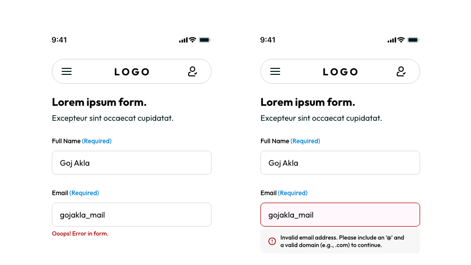
Bad error messages:
- “Invalid input”
- “Error in form”
- “Something went wrong”
Good error messages:
- “Password must be at least 8 characters.”
- “Please enter a valid email address.”
- “Phone number can only contain digits.”
- “Your username is already in use. Try a different one.”
Helpful error messages make forms easier to complete, reduce repeated mistakes, and create a smoother experience for all users.
Final thoughts
Accessibility isn’t a one-time checklist that you complete and forget, it is an ongoing process that should be built into your design, development, and content workflows from the very beginning.
By considering accessibility throughout the entire product lifecycle, teams can identify barriers earlier, make better design decisions, and ensure that accessibility remains a core part of the user experience rather than a final step.
These 10 fixes are simple to implement but can have a significant impact. When applied consistently, they improve usability for people with disabilities, create a smoother experience for all users, and help move your website closer to compliance with the Web Content Accessibility Guidelines (WCAG).
Let’s make the digital world more accessible!
Block Posts
Continue reading
More articles on our Blog